Bonfire
Bonfire is a community-driven outdoor equipment sharing experience for gear owners and aspiring outdoor enthusiasts
View Prototype.jpg)
Overview
Bonfire app is a Capstone Project that I worked on while taking a UX/UI Diploma Course at BrainStation. The goal of the project was to build a product applying the knowledge and expertise gained during the program.
The outcome of this project is a mobile app design and a responsive marketing website. This case study covers the process of defining, ideation, sketching, testing and building the final product.
Project Type
Academic
Timeline
8 weeks, Sep-Dec 2020
My Role
UX/UI Designer, UX Researcher, Interaction Designer
Tools
Pen & Paper, Marvel POP, Photoshop, Canva, Figma
Design Process
Throughout the project, I followed the Design Thinking process developed by The Hasso Plattner Institute of Design at Stanford. It helped me to understand the users better and focus on what's most important for them. Following a process has also helped me stay more organized.

Author/Copyright holder: Teo Yu Siang and Interaction Design Foundation. Copyright licence: CC BY-NC-SA 3.0
Empathise
Problem Space
Following the design thinking approach, I wanted the end product to meet the innovation trifecta and contain the essential characteristics of desirability, feasibility and viability.
Camping is considered to be one of the most affordable ways of travelling. However, when it comes to buying reliable gear, it can be quite expensive.
Because of pricy gear, many first-time campers end up buying low-quality equipment that doesn't serve them long. Others decide to splurge on gear just to find out that camping is not their thing and gear is left to collect dust. Moreover, living in a tiny condo also limits people from buying bulky equipment as there is no enough room to store it.
Secondary Research
Backpacking and camping are one of the most popular outdoor activities in Canada, especially in BC. According to Government of Canada, nearly 7 out of 10 Canadians participate in outdoor and wilderness activities, some in more than one.
Hiking and backpacking are the most popular outdoor activities:
Hiking or backpacking - 44%
Wildlife viewing or photography - 32%
Tent camping - 24%
Fishing - 22%
Canoeing or kayaking - 22%
Motor boating or jet skiing - 20%

When it comes to backcountry camping, having reliable and lightweight gear is a must. However, for beginners, the cost of essential camping equipment can be daunting. As estimated by Trail and Summit, the cost of low-end backpacking gear can total up to $1,000 US, whereas high-end gear cost can come up to a whopping $5,123 US.
Primary Research (User Interviews)
Objective: Conduct 5 user interviews with potential gear rentees to collect insights on users' camping experiences to inform personas, journey maps and app functionality ideas.
Goal: Learn how aspiring outdoor enthusiasts find/get their camping gear, what are their main pain-points, and how they think things could be improved.
Methods and tools:
- 30 minute in-person semi-structured interview to gather in-depth qualitative data
- I followed an interview script as a guide and asked follow-up questions
- The interviews were conducted online via Zoom calls
Key Findings
After synthesizing the research information, I grouped common themes and identified five main topics. I determined the pain-points and opportunities I wanted to address during the ideation phase.
First-time camping: When going on a first camping trip, people are usually not sure how to get ready and what to bring.
Expensive gear: People think that quality camping gear is expensive. They prefer to shop during sales.
Reasons to rent: People rent gear to try out a new activity or because they don't have enough storage at home.
Convenience:
- People don't want to travel far to pick up an item
- People want to rent specialized items
- People value convenient website
Safety and reliability: When it comes to booking services online, people value transparency of price, terms and policies. Also, they want to have a customer guarantee.
Please add a Testimonial
Please add a Testimonial
Please add a Testimonial
Please add a Testimonial
Please add a Testimonial
Please add a Testimonial
Please add a Testimonial
Please add a Testimonial


Define
Persona & experience map
Based on the user interviews, I built a primary persona to create a realistic and reliable representation of the key user group. Then, I crafted the persona's experience map which helped me empathize with the user group and craft a digital experience that is tailored to their specific needs.

User Persona

Experience Map
Design challenge
After collecting the research insights and based on the persona, it is clear that aspiring outdoor enthusiasts find camping gear expensive, they're often not sure what to bring on their first trip and they end up buying cheap gear. I started thinking about the ways of helping them access high-quality gear to try a new activity.
How might we
provide current and first-time campers with better access to a variety of reliable camping gear in order to lower their barrier to entering advanced outdoor activities?
Task selection process
Keeping the design challenge, assumptions, and hypothesis in mind, I came up with 30 user stories that reflect Alicia's needs as a first-time camper. Then, I grouped them into 4 epics: filtering and sorting, payments and policies, rating and reviews, booking. I chose to focus on the filtering and sorting epic to create my minimum viable product (MVP).

Core Epic - User Stories

Task Flow
Ideate
Sketching
Before getting into sketching, I put together a visual identity moodboard and a UX Inspiration board. I wanted my app to feel light and adventurous. But most importantly, I wanted it to follow Jacob's Law, which I think is essential in designing any digital product in order for it to be successful.

Source: https://lawsofux.com/jakobs-law
Then, I started sketching ideas on how the mobile app would look like using inspiration from existing apps like AllTrails, Airbnb, Turo as well as Google Apps. After examining and comparing the results, I chose the ones I wanted to explore more in the next step, which is lo-fi wireframing and user testing.


Prototype
Low-fi wireframes
For the next step, I crafted the 1st draft of the grayscale wireframes. I decided to test my ideas early on in the process so I built a Figma prototype using these wireframes for further usability testing so that I could base my final high-fidelity prototype on feedback from potential users.
View 1st iteration of low-fi prototype
Test
I conducted 2 rounds of usability testing with 5 participants each. I connected with the testers over Zoom calls and shared the Figma prototype with them. I prepared a scenario and set of tasks I gave them to complete during the test. Participants shared their screens so I was able to observe how they interact with the app while taking notes.
Scenario
Your name is Alicia and you're a college student. Imagine you've never been on a camping trip before and your friends invited you on a 2-day overnight backcountry trip. You jumped at the opportunity and want to go with them very much. Since you've never camped before, you don't have any gear yet. You don't have the budget to buy the whole camping set at the moment. Your friends have kindly agreed to borrow you some stuff, but you still need a tent.
You will use this app to rent an ultralight tent for your camping trip. Your main goal is to find the best quality for the penny. You're looking to book it from June 27, 6 pm to June 29, 8 pm.
Usability testing - Round 1
With the help of the feedback received during round 1 of usability testing, I knew where to focus on my next iteration.
According to the overall testing results, almost all users had issues with noticing the total price of the item, so it was one of the priorities moving onto the next step. Also, users had challenges with the booking process, they were confused to be taken back to the listing page after confirming the availability of the tent. So I updated the flow to make it more simple and lead them straight to the booking confirmation page.

Overall testing results - round 1
Design changes after round 1


Usability testing - Round 2
Overall the results improved during the round 2 testings. Some tasks still needed improvement, but overall the app flow, sections and components were clear to users and they completed all the tasks.

Overall testing results - round 2
I implemented the changes based on the feedback and created the 3rd iteration of grayscale wireframes. With this version, I moved on to the next phase, which is high-fidelity prototyping.
Design changes after round 2


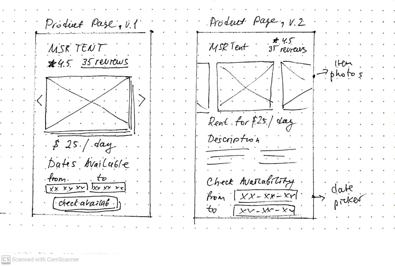
Product page iterations
Here's an example of page evolution from paper sketch to 3 versions of digital wireframes. With each iteration, I took into consideration the feedback from the usability testing and felt confident enough with the final version to move onto high-fidelity prototyping.
View final low-fi prototypeVisual Identity Story
Before getting into high-fidelity prototyping, I once again went over my inspiration boards and thought about the overall look and feel for the app. I wanted the app to represent the words:
adventurous
fun
curious
warm
friendly
cozy
These adjectives helped me to find illustrations and images that conveyed the overall feeling that I wanted to communicate. They also helped me to define the colours I wanted to use for the app interface.
Colours

I wanted to create a palette with colours that are associated with nature. The warm tone "Bonfire" represents the fire. The cool tone "Moody Sky" represents mountains and ocean. The orange colour "Sunshine" represents summer sunset, and the black "Dark Soil" represents forest soil.
Logo
When starting working on the wordmark and the logo, I knew that I like very simple and minimalist style. After looking at my inspiration board, I came up with these variations.
The final logo contains a simple vector illustration of the bonfire that is legible and easily transferable to any size. The name is written in MuseoModerno typeface, a modern geometric font-family that is simple and easy to read. It is also suitable for 25 different languages.
Typography
I wanted the typeface to have a clean and easy feel. After researching a variety of font families, I decided to go with Avenir as it is an elegant typeface that has a wide variety of weights and looks legible both on mobile and desktop. I used Roman, Medium and Heavy weights with sizes varying from 14 px to 44 px. I created text styles in Figma for future reference.

Iconography
For icons, showing different types of activities, I decided to go with the ones that have a little bit more details in them and look more fun and engaging. For system and navigation icons, I used the ones from the Material Design library.

Final prototype
Final high-fidelity prototype showcases the task flow of Alicia searching for an ultralight tent, checking its availability then booking it for the dates of her trip.
View interactive prototype


Landing Page
Any digital product needs to have a designated landing page. The landing page is the place where users are taken from the paid ads. Its main goal is to highlight the app benefits and to move visitors to take the primary desired action, in this case, downloading the app.I created two versions of the site: desktop and mobile.

Web app
The primary research revealed that most of the users use web apps when shopping or booking something online. I also found out that when shopping, users usually browse items on their phones first (for example, during their daily commute), then later they finalize their purchase on a browser. They find a bigger screen more convenient for reading information and data input (for example, the checkout process).
After considering these insights, I decided that having a web version is essential for an app like Bonfire. I believe it will ease the experiences of many users.

Design impact and future considerations
I think, once Bonfire gets built and shipped, it would have a great impact on the outdoors community. With the rising popularity of peer-to-peer sharing apps in many different fields (car share, storage space share, house share, parking share), I can assume that it would be easy for people to start using the Bonfire app. Providing better access to high-quality outdoor gear, Bonfire supports aspiring adventurers and promotes a healthy lifestyle. The app will also promote conscious shopping as it allows users to test different equipment before buying it.
Value Proposition
Bonfire's main competitive advantage is unlimited gear variety, listings price flexibility and delivery options. It will also provide unbiased reviews from real gear rentees so that inexperienced newcomers can choose gear that fits them best.

Marketing Strategy
For starters, Bonfire will use paid ads on social media and YouTube to drive traffic to the landing page. The ads will contain a short video showcasing how it is easy to rent gear using Bonfire and get it delivered right to you. Later, we'll create a curated list of outdoors influencers who share the Bonfire values and sign an ambassador contract with them.
Risks Management
During the primary research, I learned that people pay special attention to the safety and reliability of the products they use. One of the main objectives for Bonfire moving on would be to come up with guidelines on growing a safe community by pre-screening users, providing a flexible cancellation policy and transparent security deposit guidelines.
Next steps
- Test: Usability testing of 1st iteration of the high-fidelity prototype with at least 5 users
- Design iterations: Update design based on the feedback received and build the final prototype for development hand-off.
- Work on the other epics: Current MVP only represents a task flow of renting an item. Moving forward, I will think about how the app would look from the owner's perspective, for example listing a tent on the app and getting bookings.